So for my business cards I wanted to create something that had a humorous feel to it whilst also showing people on the card a small snippet of what i can do. I researched online into business cards and from last year I also took the last third years business cards to look at as they had already gone through this before. What i got from it mostly was that Professionalism in a business card is key but as these business cards are just for the end of year show mostly i thought that humour would work better.
I was inspired by the drawing below to do a human and polar bear mash up, this i will revisit when i have more time as i think it's an awesome idea for a business card :)
 - inspiration :)
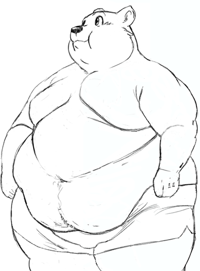
So i started by drawing a nice lil' old plobear :)
He comes from my love of this plobear


He's so cute :)
Any who i drew a plobear in photoshop and incorporated the name Lowrybear into it as that is what some people call me with Lowry being my last name. I decided to use this as like my slogan so that people have a name to recognise and i think its pretty memorable and easy to read and say so it ticks all of the boxes.
O have also checked that this name is not copywriting and later on in the year i will be copywriting it, I have also set up all my social networking accounts to Lowrybear and will be getting a friend to probably make a website for me later on in the year which will obviously be
www.lowrybear.co.uk
or something along those lines.

I used simple yet effective icons to symbolise my twitter, phone and email account to save space on the card. From researching business cards i found a lot of them do this and it does make them much more appealing and utilise the space on the card. I chose to go with a white background as i thought it went well with the white of the plobear.

Here is a more professional one i made as the less things on the card the more you focus on the image on the back which is where you should briefly show off your work.
Too plain?
Font needs to be in different position?

So to make it more colourful and try something different i decided to incorporate my work onto the front cover as well i took a skybox Jpeg file i had made in second year and photoshopped it onto the card.
I like the finished effect however I'm not sure if it would be taken seriously at an event, i will have to try these cards out and see what response i get to learn from this.
Front
Back

I also incorporated my work onto the back of the card so people could have a little snippet of something I had made for my FMP.
I think the card design and layout go well together, I will be printing out both black and white ones along with colour ones to see which ones are more popular and see which ones people like best, this way I will know which to go for and tweak in the future.
I also looked into creating a more professional business card from a proper printing company, I thought as these business cards are mainly a mock up or stand in business card for the time being I didn't need to send off for them, however when i do i will be using either ukmoo.com or vistaprint.co.uk
These both have pretty sweet deals in terms of cost and shipping so when i am fully ready to create my final fully professional business card i will use them.
No comments:
Post a Comment