Wednesday 28 November 2012

animating my crack o_O .... your what?

My part to animate was the ice crack so when i finally got my ice crack finished i looked into images of ice shards before starting as i knew this is what i wanted it to look like and have ice shards flying past the camera. Here's the images i worked from-


So i started my animation and imported the robot and mammoo as reference so that it would look more realistic. With the robot's two drills i presumed that most of the shards would come out the sides and as the robot jumped out the ice shards would crack. So i did the best i could with what i had and figured if all else fails a good camera angle would easily fix it. 
Here's how i did it - 


I used cubes to think best where to position the cracks and where the most of them would appear. 

and here's them after texturing i tried to add different blues into them in photoshop with different opacity's but you couldn't really tell in the animation, i tried though.

Here's some play blasts of my animation, i really like the first one best as the shard flys straight past the camera, I'm going to look into doing this with the camera's and it should work out better than this


Overall i was confident whilst animating and felt that i could figure out the buttons much easier than previously animating. I thought much more about time and the principles of animation, as in gravity wise what the ice shards would do, how much they would way, what the force of the robot would have  impacted on them and i tried my best to apply this in the short amount of time we had left. If i were to do this again i would take longer so i could get this down to the point where i was completely satisfied with it. 

Adding particles, nearly done!

Next thing i did was the particles, this was easy for me once i got the hand of what everything did, annabeth explained to me what some things meant and this helped me a lot to figure out which values to give the particles. 


i added snowflakes to the scene 


chimney smoke with a bit of sidewards wind


this was me just messing around, an explosion was not needed :)
cool though. 


I'm gonna use this for other animations, found a great way to make an explosion! 


I wanted the fire to seem more realistic so instead of just using a simple fire i added a smoke particle and an embers particle too so they would all work together and look better.


All the particles overall made the scene look much better from the feedback sheet too people had said to add these. 

cell shading in unity


annabeth showed me how to do this but i'm going to look more into it and experiment in unity as it was done very fast. It made our animation have an extra cartoony feel to it as you can see in the screenshots below. A black outline was put around everything. You have the option to do this on certain objects or all of them if you wish, i bet it would create a create comic book effect in a game like XIII,
loved that game!


As you cans see the outline of the mountains with a thin black line, we should have turned this up i think.


XIII on the old xbox. Still got this, epic gameplay

Time lapse creation and it's animation. Proud of this :D

I enjoyed doing this time lapse so much and it just showed me that i can actually draw in photoshop even though i think i can't. Annabeth and i brain stormed on how this would be done, she thought it best to make a sphere and turn it inside out then texture it normally, which i did. It worked perfectly. 
From doing this i learned some neat skills for future use such as animating the time lapse, drawing it and remembering that i can turn things inside out in maya. It is easy to forget this when your normally uv mapping things on the outside. 

Also here's a mood board i made from researching the web, i wanted the sky to feel very majestic and blend in well with the mountains. I took my time to find the right colours whilst drawing in photoshop and used many different opacities and try's to get it right. 

Here's the finished thing, yay!


I found i had to rotate it as the axis it was on made the sky turn different times of day in the animation which obviously looked wrong. 


looks a bit like a planet :)

morning 
day
evening
 night

I tried my best to get the transitions in photoshop from day to night etc so they would just turn from day to night but fade. I did this pretty well i think but forgot to do night to morning, oops. 

then i just exported it into unity, made it big enough to put my terrain in and animated :)


Next was to animate my time lapse, so i had to create a new scene for the animation and use the cameras to record what i wanted telling them what time to start/stop how fast etc...
I used reference from working out times so that i would know how many frames it was how fast it need to be, i also did this for my crack animation. 


Here's a quick clip of my time lapse in action, if i would have had more time i could have refined it more and would have liked to have had it end in the correct place which was morning again. 


Re-wrapping my alien

Seen as i'd got better at uv mapping and am starting to actually understand it now, i decided to give texturing my alien another go cause to be honest it looked crap.
So i restarted and drew all his textures in photoshop and i'm quite plesed with the results :)
There's a few things i'd change if i had time to take more time on it but least it looks way better then the stretched textures before.
Here's some pics -


HULK SMASH - Working out camera angles with toys :)

As we were running out of time i had to start thinking about camera's so i wrote up a lot of shots we could use and used the time sheet i had made easier to make a good guess at how long each shot would be and what shots would be best to use. Here's the camera shots i worked out from my head. 


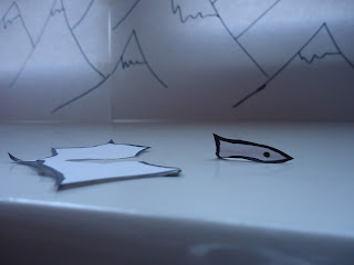
I thought that with a visual aid we would get a better idea of what we wanted and how we wanted the story to be told through the camera. So i grabbed some toys and set up a quick draft scene of the mountains and where abouts things would be for timing etc...
Here's pics of all the shots i took and whilst i was doing this was referring back to the written shots above all the time. 
It helped so much when i came to doing cameras as i already had all of this in my head ready to go. 


Wide shots to begin with so that we could see the scenery created and show just how small mammoo and the igloo were in comparison 


as mammoo walked around the igloo to his fishing equipment we see a close up of his face and or body.


I also thought a good shot may be an over the shoulder one as mammoo was walking towards the dreaded fishing hole 


i obviously couldn't show this one clearly but this is the underwater shot. I am definitely going to put this one in, then the audience will wonder what it is under the water which will create a great sense of suspense  Then BOOM! the robot jumps out. 

 tug tug

!


possibly a birds eye view of the ice crack if we have time?


two shots here showing the size in comparison to mammoo and the robot. This will create a sense of intimidation and should be a great shot to include. 


if we have time we should incorporate the lock on screen in after effects into the camera shot 
(don't think at this stage we have time though)


pan back to see both of them to show size comparison again. 


I really like the two shots above over the shoulder shots again.


If all else fails and we run out of time a stop shot of the robots foot crushing mammoo would be great, in this shot i want to get the camera on the ground focused on the robots foot possibly from mammoo's angle. 


the fish jumps out. 
FIN 
:)